Introducing Our New Best & Bloom Branding!
You may notice something a little different on our pages! When Best & Bloom first launched, we kept things simple - so we could begin our journey and focus on building our independent business and creating timeless, original arrangements that bring joy.
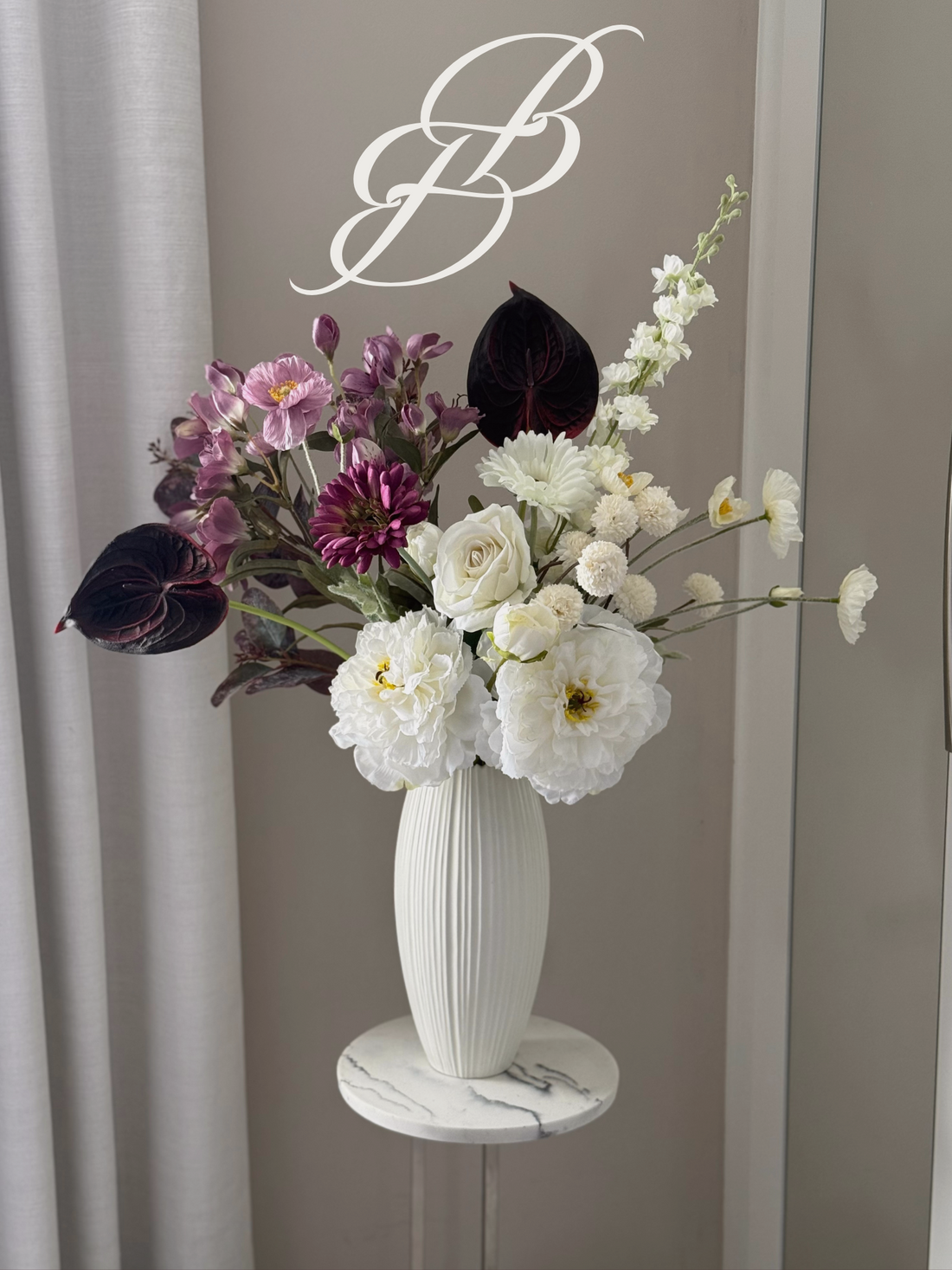
Now, as we continue to grow, it feels like the right moment to reflect that journey in our brand identity. We’ve introduced a new logo that still celebrates the Best & Bloom “BB,” but in a way that feels more abstract, organic, and refined. By placing the two B’s together, we created a mark that’s both elegant and ever-so-slightly floral in shape, a subtle nod to the heart of what we do.
We also chose a rich, deep plum as our new brand colour. To us, it’s versatile and timeless: elegant on packaging, beautifully echoing the deep petal tones in some of our arrangements, and perfectly at home through the colder months while still glowing with sophistication in the summer season. It feels like the natural next step in our evolution.
This refresh is about growth. Over the past months, we’ve loved hearing your feedback, expanding our product range, and even finding opportunities to collaborate with businesses who share our values of originality, charm, and sustainability. Every bouquet, frame, and partnership helps us learn and evolve, and this new look feels like a reflection of the journey we’re on.
In the coming weeks, you’ll see our refreshed branding, colours, and packaging gradually make their way into the world (you may see some of our old branding for a little while, as we don't want to waste any of what's left in stock!)
We’re so excited to share this new chapter with you, and we hope you love it as much as we do, and while you're here, please do take a look at our latest collections on www.bestandbloom.com